■ 応用編
safari/chromeでご覧いただけます。
開く窓

サンプルhtml
--[ html ]-----------------------

<div id="bg_house">
	<div id="window_position">
	<div class="windows">
		<div class="sample02"><img src="./img/window.gif" /></div>
	</div>
	<div class="windows">
		<div class="sample03"><img src="./img/window.gif" /></div>
	</div>
	</div>
</div>

--[ CSS ]------------------------

div#bg_house{
	width:150px;
	height:104px;
	background:url("../img/house.gif") no-repeat;
}
div.windows{
	width:44px;
	height:30px;
	float:left;
}
div#window_position{
	width:88px;
	height:30px;
	position:relative;
	top:53px;
	left:33px;
	background:url("../img/inframe.gif") 22px 0 no-repeat;
}
.sample02 {
	text-align:right;
	-webkit-animation: rotY1 5s linear;
	-webkit-animation-iteration-count:infinite;
}
@-webkit-keyframes rotY1 {
	0%	{ -webkit-transform: rotateY(0deg); }
	20%	{ -webkit-transform: rotateY(180deg); }
	80%	{ -webkit-transform: rotateY(180deg); }
	100%	{ -webkit-transform :rotateY(360deg); }
}

.sample03 {
	-webkit-animation: rotY2 5s linear;
	-webkit-animation-iteration-count:infinite;
}
@-webkit-keyframes rotY2 {
	0%	{ -webkit-transform: rotateY(0deg); }
	20%	{ -webkit-transform: rotateY(180deg); }
	80%	{ -webkit-transform: rotateY(180deg); }
	100%	{ -webkit-transform :rotateY(360deg); }
}
幻想的
落ち葉
サンプルhtml
http://webkit.org/blog/324/css-animation-2/
こちらのサンプルを元に作成しています。
作り方は関連URLをご参照ください。
Sun Set
サンプルhtml
--[ html ]-----------------------

<div id="body">
    <div id="lake_yuugata">
	<div id="sun"></div>
	<div id="refrect"></div>
	<div id="yama"></div>
</div>

--[ CSS ]------------------------

#body{
	background:url("../img/lake.jpg") no-repeat;
	-webkit-mask-image:url("../img/lake.jpg");
}

/*----------------------------------------------------*/

#body.hover{
	-webkit-transform:;
}

#boat {
	width:151px;
	height:70px;
	float:right;
	position:relative;
	top:230px;
	-webkit-transition: all 30s ease-out;
	-webkit-transform-origin: 50% 50%;
}
#boat:hover {
	-webkit-transform: translate(-400px, 0px);
}

/*----------------------------------------------------*/

@-webkit-keyframes lake_yuugata {
	0%	{ opacity:0; }
	100%	{}
}

div#lake_yuugata{
	width:480px;
	height:356px;
	background:url("../img/lake_yuugata.jpg") no-repeat;
	-webkit-animation-name:lake_yuugata;
	-webkit-animation-duration:10s;
	-webkit-animation-iteration-count:1;
	-webkit-animation-timing-function:ease-out;

}

/*----------------------------------------------------*/

@-webkit-keyframes sun {
	0%	{
		-webkit-transform: translate(0px, -200px);
		}
	100%	{
		-webkit-transform: translate(0px, 0px);
		}
}

div#sun{
	width:480px;
	height:480px;
	position:relative;
	top:-240px;
	background:url("../img/sun.png") no-repeat;
	-webkit-animation-name:sun;
	-webkit-animation-duration:20s;
	-webkit-animation-iteration-count:1;
	-webkit-animation-timing-function:linear;
}

/*----------------------------------------------------*/

@-webkit-keyframes refrect {
	0%	{
		-webkit-transform: translate(0px, 300px);
		}
	100%	{
		-webkit-transform: translate(0px, 0px);
		}
}

div#refrect{
	width:480px;
	height:480px;
	position:relative;
	top:-460px;
	background:url("../img/refrect.png") no-repeat;
	-webkit-animation-name:refrect;
	-webkit-animation-duration:20s;
	-webkit-animation-iteration-count:1;
	-webkit-animation-timing-function:linear;
}
/*----------------------------------------------------*/

div#yama{
	width:480px;
	height:286px;
	position:relative;
	top:-930px;
	background:url("../img/yama.png") no-repeat;
}
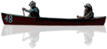
Lake
ボートにマウスを載せると動きだします。
サンプルhtml
--[ html ]-----------------------

<div id="body02">
	<div id="boat"><img src="./img/boat.png" /></div>
</div>

--[ CSS ]------------------------

#body02{
	width:480px;
	height:356px;
	background:url("../img/lake.jpg") no-repeat;
}

#body02.hover{
	-webkit-transform:;
}

#boat {
	width:151px;
	height:70px;
	float:right;
	position:relative;
	top:230px;
	-webkit-transition: all 30s ease-out;
	-webkit-transform-origin: 50% 50%;
}
#boat:hover {
	-webkit-transform: translate(-400px, 0px);
}